
If you’re interested in web design or looked into getting a new website, you’ve definitely come across the term responsive design before and wondered what exactly it means.
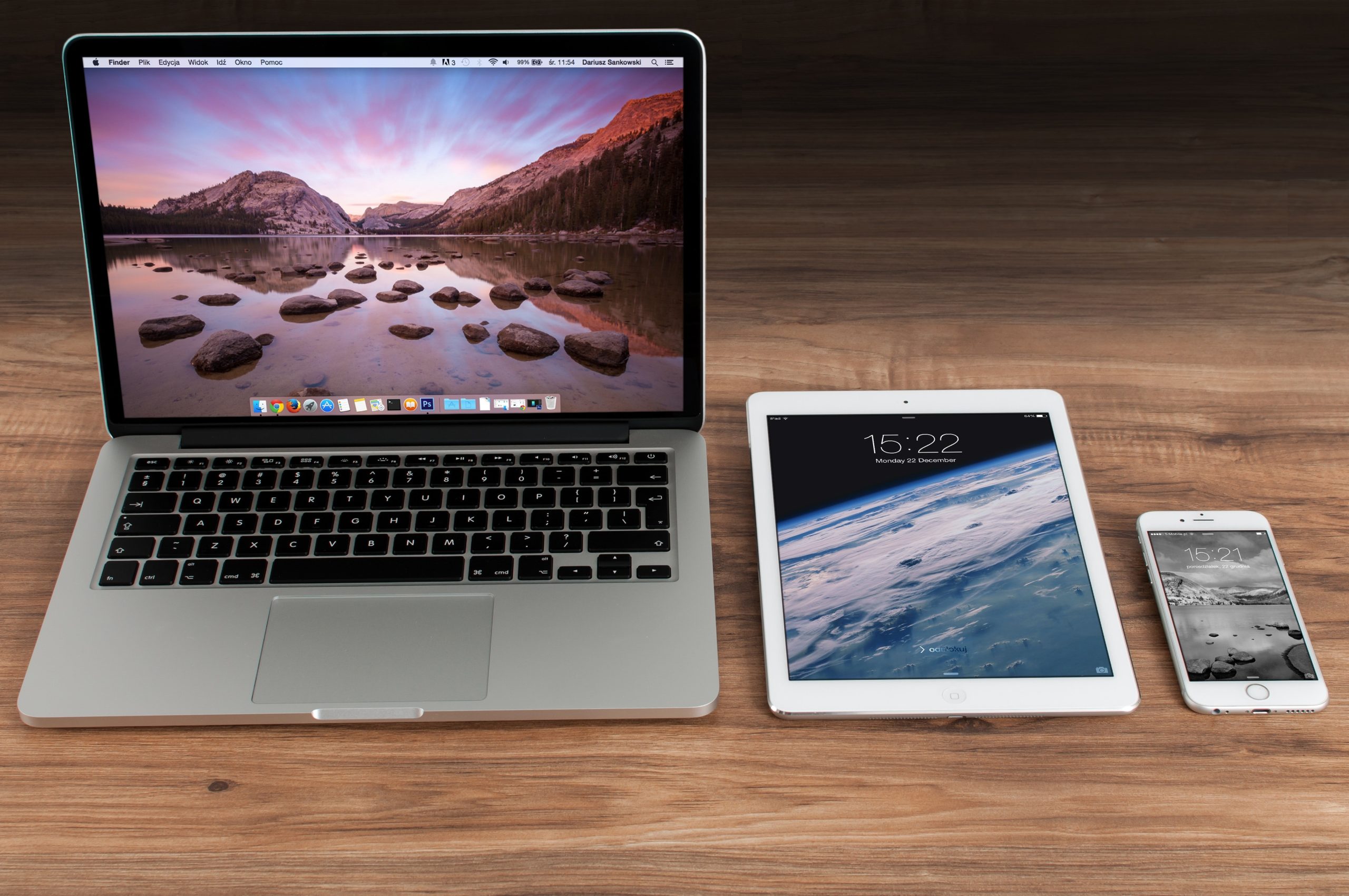
In short, responsive web design is an approach to web design that means the site responds to the user and their environment, no matter what device or browser they’re using or how large their screen size/window size is. This is done by making the layout able to contract or expand depending on the user’s viewport (screen), creating an adaptive design that provides a better user experience (UX). If you want to learn more about responsive design, here’s a beginner’s guide. We’ll go over everything you need to know about responsive design, why it’s the way forward and the best way to create a modern, functional website, and some basic steps to create responsive websites and examples of responsive web design in practice.
Why Responsive Design Matters
Having a responsive design for your website is crucial. It ensures that your website looks and functions at its best, regardless of the device people use to view it – be it a mobile device, tablet, or desktop computer. With over 55% of all internet traffic coming from mobile devices as of August 2023, optimising for multiple devices is more important than ever before. We live in a mobile-first world today, so while making your website responsive for desktops will always be necessary, you also have to consider the mobile version and different screen sizes during the website design process. This will help you avoid having a clunky and unattractive website with slow page loading times, which can drive away more than half of your website’s viewers. A survey conducted by HubSpot revealed that over 93% of people leave a website if it doesn’t display properly on their devices. As such, designers should never neglect the mobile version of their website.
Where Did The Concept of Responsive Web Design Originate?
Ethan Marcotte first introduced the concept of responsive web design in 2010 in an article for the design magazine A List Apart. Marcotte predicted the surge of mobile browsing and emphasised the need for web designers to adapt. He proposed that developers and designers move to create websites with one design that seamlessly responds to the user across all devices.
The alternative is creating different designs for each device, otherwise known as adaptive design, resulting in a never-ending arms race to keep up with personal devices and mobile phone screens. Marcotte had complete conviction about the need for web designers to develop responsive design skills, stating in his seminal article: “This is our way forward. Rather than tailoring disconnected designs to each of an ever-increasing number of web devices, we can treat them as facets of the same experience.”
The Basic Principles of Responsive Web Design
Web designers can achieve a responsive website by strategically using flexible grids, layout elements, and adaptable images and media. Incorporating these elements in the web design process allows web pages to automatically adjust and rearrange their content to fit various window sizes. Doing this leads to smooth navigation, effortless interaction, and an enhanced user experience that increases user engagement and satisfaction. Web designers use HTML and CSS (Cascading Style Sheets) frameworks like Bootstrap to create responsive websites.
We’ll expand on the fundamentals of responsive web design below:
Fluid Grids
One of the key ways to make a design responsive is by using fluid grids. These grids allow content to resize and adjust based on columns. Essentially, fluid grids mean every element on the page occupies the same percentage of space, however large or small the screen becomes. The grid layout can also adapt based on breakpoints, allowing for a seamless and consistent user experience across different devices and screen sizes. By employing fluid grids, designers can create a flexible and adaptable interface.
Breakpoints
In the CSS coding language, breakpoints are specific points in the range of screen widths that trigger changes in the design and layout of a website to adapt to various devices and screen sizes. Designers define these breakpoints as set pixel values in CSS. Once the website reaches these values, elements such as the grid and layout adjust to create a different CSS style to provide the best user experience possible.
Designers can set breakpoints based on the screen resolution of different devices. Here is an example of the breakpoints a designer might set for their website, at which points the website will change:
- Small devices (e.g., smartphones): Below 600px
- Medium devices (e.g., tablets): 601px to 992px
- Large devices (e.g., desktops): 993px to 1200px
- Extra-large devices (e.g., large computer screens): Above 1201px
A design example of breakpoints in use would be a website that changes from multiple columns on a desktop layout to a single-column layout based on screen size at the 600 px breakpoint. You can also use breakpoints to shrink the sidebar to a simpler and smaller menu at specific screen sizes.

Flexible Images and Media
One of the most surefire ways to make your website more responsive is to ensure the images and media on your website are flexible. “Flexible” in this case means images and media should be dynamic and resized based on the width of the screen. This means responsive images always display in their original size unless the screen size is too narrow. If it is, the image’s width scales down with the size of the screen.
Using CSS, designers can ensure the maximum width of the image is set to 100 % of the screen or browser width. When the screen becomes too narrow, the image will scale its height and width without distorting or overflowing the layout. WordPress automatically implements this functionality for any images or media files uploaded.
Media Queries
Media queries are rules designers can set in CSS3 to ensure their website is both mobile responsive and desktop responsive. Media queries allow the layout, HTML blocks, font size, colours, and other design elements to change to accommodate the user.
To work with media queries, designers must choose the breakpoints and rules they want to set. They can then apply the rules when certain conditions and breakpoints are met. These conditions might include viewport width, height, device orientation (landscape or portrait), or screen resolution. Designers can make their media queries even more specific, such as adjusting when the viewer uses a touch screen or mouse.
Here’s a simple example of how to use media queries: a designer might set a rule that reduces the text size when the user’s screen resolution is below 600px, the standard smartphone resolution.
Mobile-First Approach
Many proponents of responsive design use a mobile-first approach. This means they focus on the smallest screen sizes first and then progressively enhance the layout and features as the screen size increases instead of using the traditional method of designing for larger screens first and then scaling down. The idea is to ensure that the core functionality and basic layouts are, by default, optimised for mobile devices, meaning they never get left to the wayside. The mobile-first approach has its detractors, but it’s gaining popularity, considering mobile browsing now dominates.
Mobile-first design also ensures designers don’t add too many unnecessary elements to the website that would have to be axed for the mobile version.
Content Prioritisation
This leads us to our next concept: content prioritisation. If everything is emphasised, nothing stands out, especially on small screens. Not all content and features are equally important across devices, and smaller devices have limited screen real estate. A responsive website isn’t overloaded with features that only look good and function well on larger screens.
While having multiple columns and a wealth of informative content on your landing page might be great for desktop, it can look messy on mobile versions. This can cause essential information to be pushed down to the bottom of the page, forcing users to scroll endlessly. That’s why content prioritisation is critical. It involves identifying important content and ensuring it’s easily accessible and prominent, even on smaller screens, while less vital content is hidden or reorganised.
From A Design Concept to a Key Strategy
Mobile browsing has become even more popular than Marcotte could have possibly predicted in 2010, now accounting for the majority of all browsing. As a result, responsive design has gone from a concept to an essential strategy you need to implement if you want your website to be successful and have a good user experience. We hope this article helped set you on the right path to creating a responsive website that functions beautifully, no matter the device. If you need a bit more guidance, check out our article on the more broad fundamentals of web design.


