Colour is incredibly important when it comes to branding and website design. You may not realise it, but colours communicate more than what meets the eye – every colour can be associated with an emotion, an idea or a personality trait.
Take a look at many fast food restaurants and you’ll find they use red and yellow, as these colours encourage hunger while being friendly. In contrast, a restaurant like Subway chooses to use green and yellow instead of red to communicate and support their “eat fresh” tagline.
While there are some tried and true associations with every colour, things such as cultural differences can change a colour’s meaning drastically. For example, red in many western countries means passion or danger. In some eastern countries, red is a lucky colour. These two associations are very different and can change how your brand appears, depending on your audience and the context your business is in.
If you’re in the process of refreshing your website, or you’re creating your first website, one of the most important decisions will be the colours you use throughout the website for headings, links, design elements and more.
Why is colour so important in website design?
Colour selection can significantly impact a company’s bottom line – particularly if that company is mostly online. 85% of people claim that colour has a major influence on what they buy – so if you choose the wrong colour for your audience, you could be harming potential business.
You can test how colour impacts your bottom line by changing something as simple as your website button colours. When some companies experimented with button colours, they noticed a sharp increase or decrease in conversions. Beamax, a company from The Netherlands that make projector screens, saw a massive 53.1% increase in clicks on links that were red vs links that were blue. Choosing the right colour goes beyond website clicks too. A study on the mental impact of colours discovered that colours boosted brand recognition by an average of 80%. You can see this in practice when you think of a brand such as Coca Cola and their iconic red beverages.
So, colour is very important beyond what looks good. The right (or wrong) colour can have a big impact on your website visitors and conversions.
What is colour theory?
Colour theory is a set of fundamental principles that guide you in creating colour combinations that work together. It is important to understand these basic principles in the process of creating effective colour palettes for your website (or brand). Here are a few of the fundamentals in colour theory:
The Colour Wheel
The colour wheel is a great place to start when exploring colours. Most of us will have seen a colour wheel in some variation or another (such as in art class at school), and you may recall that there are primary, secondary and tertiary colours:
Primary Colours
The primary colours are red, yellow, and blue. If you combine any two of these colours, you create secondary colours.

Secondary Colours
Secondary colours are purple (formed by mixing red and blue), green (formed by mixing blue and yellow) and orange (formed by mixing red and yellow).

Tertiary Colours
Tertiary colours are combinations of primary and secondary colours, such as red and purple, yellow and orange, or blue and green.

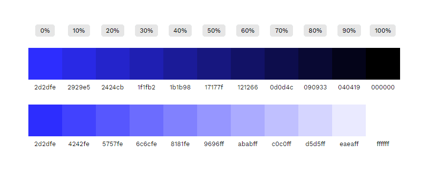
Tints, shades and tones
Primary, secondary and tertiary colours are traditionally considered “pure” colours. They are bright, vivid and full of colour. If you add white to a pure colour, this creates a tint. It creates a lighter, less intense colour than the pure colour. If you add black to a pure colour, this creates a shade. And, if you mix white and black to a pure colour, this creates tones. Tones are more subdued than pure colours.
Contrast
Contrast is highly important in website design and when choosing colours for a brand. The higher the contrast, the easier that two colours can appear different from one another – such as a bright colour paired with a dark colour.
While it is important to consider the contrast of the colours, it’s also important to evaluate the contrast of their tone. Two different colours with an even tone will not have high contrast. An easy way to decide if two colours have good contrast is to convert them to greyscale – this will make the contrast much clearer.
In most instances, you want to find two (or more) colours with high contrast for website design, as this makes it easier to read and easier to locate buttons or actions. White text on a black background is the most obvious choice. However, there is a careful balancing act, as too much contrast can tire the viewer’s eyes (also referred to as eye strain or eye fatigue). The best places to use contrast are between text and background and between buttons and the background. Use less contrast between background sections or between the menu and background, if you are using too much contrast already.
What is colour psychology?
Colour psychology is a step beyond colour theory. Colour psychology is the science of how colours affect human behaviour and the subconscious associations people have with colours. This means, the choice of colour for your brand, product or website can impact how a person feels about it – they may become energised, calmed, angered or otherwise depending on the colour you choose.
Unfortunately, not every person responds to colours in the exact same way, and it can be somewhat of a subjective topic. Colour associations can change across the industry you’re working in, the culture you’re selling to, people’s personal beliefs, and different genders and their individual preferences. This means there are no guarantees about its effect on conversion and branding. Subsequently, this is why understanding your audience is so important. Despite this, there are some common associations with colours that have been proven more frequently than not.
Colour evokes emotion
Blue is the most popular colour in the world. People are drawn to particular colours because those colours bring out emotions. In the same vein, colours can also cause a negative reaction. And, these reactions can change depending on the context. In some contexts, red may cause a person to feel fear or anxiety, while in another it could communicate passion and excitement.
Colours used in website design need to be woven together seamlessly with other elements on the page, such as typography, imagery and copy. Be careful using particular colours depending on your product, service or industry. Colours may communicate different things.
Colour meanings
There are some common meanings associated with colours in most circumstances. Use these as a guide only, as depending on the context, these colours may have different meanings.
Red
Vibrant and aggressive, red can convey opposing ideas depending on the context. A deep red paired with black will give you a masculine, aggressive feel, while red paired with white or gold speaks to love and passion. Red often represents danger such as stop signs and blood.
Represents: Passion, power, love, danger, excitement
Blue
Blue is the most popular colour choice for brands, with around 40% of brands using blue as their primary brand colour. Blue evokes feelings of calm and peace. It’s also a trustworthy and reliable colour. Blue may also make your brand appear logical.
Represents: Calm, trust, peace, logic, reliable
Green
Green is a colour often used for healthy and natural products (or products that want to appear healthy and natural). Often, green can be used for wealth, abundance and prosperity due to its association with money.
Represents: health, nature, abundance, prosperity.
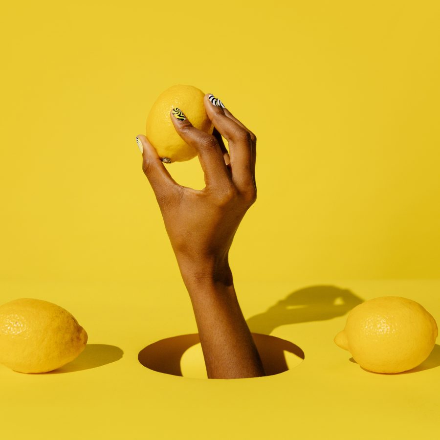
Yellow
Often associated with the sun, yellow is a warm colour that reminds people of summer. Yellow is the most visible colour on the spectrum. Yellow communicates happiness, optimism and friendliness. It can also be associated with creativity. Careful using yellow with colours like black, as these colours are often used together in construction and safety.
Represents: Happiness, optimism, creativity, friendliness.
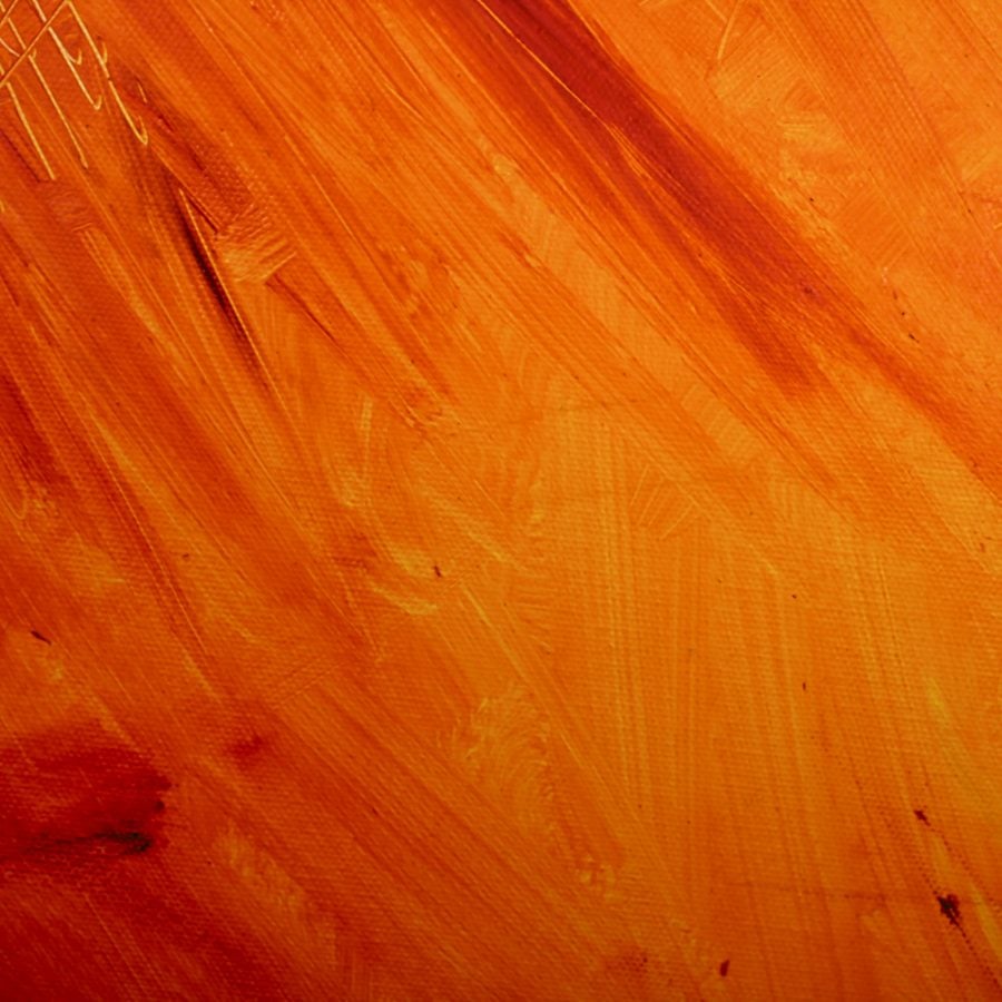
Orange
Less aggressive than red but stronger than yellow, orange is often used in construction, safety and safety equipment. Orange can sometimes be associated with autumn due to the orange leaves. Orange can evoke a fun and energetic atmosphere.
Represents: fun, freedom, warmth, comfort, playfulness.
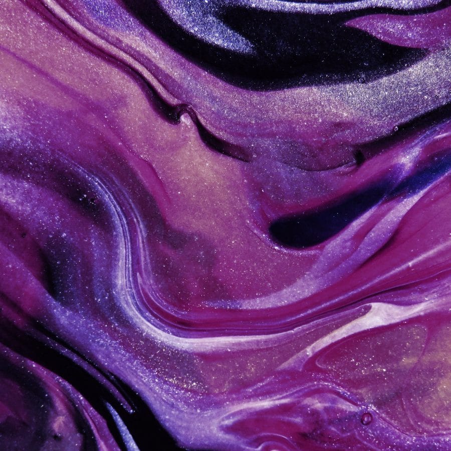
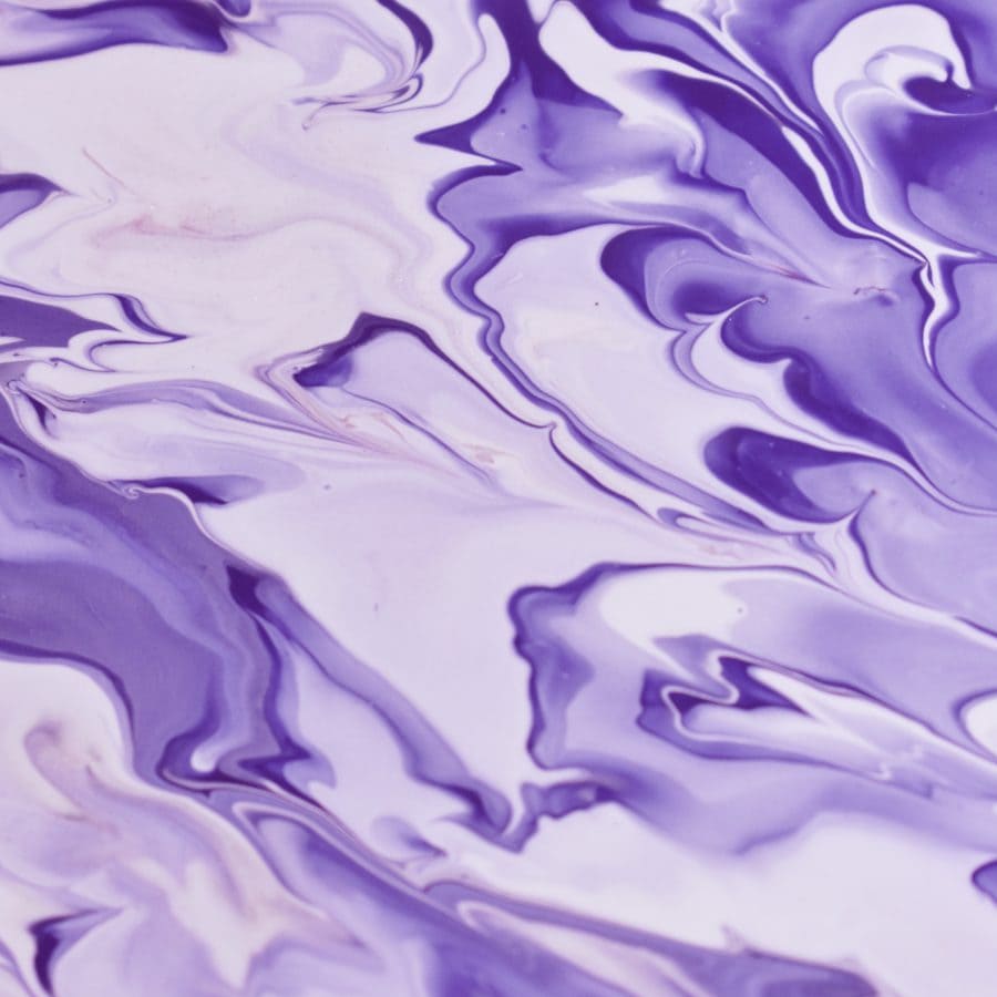
Purple
Purple is a colour used by brands that want to appear sophisticated and rich. Purple is a luxurious colour because of its long, traditional associations with royalty. It is also a mysterious colour because it can be dark and moody.
Represents: luxury, sophistication, loyalty, mystery.
Pink
Pink is a colour often used when marketing towards females and younger generations – such as ‘millennial pink’. Pink is a nurturing and gentle colour. It can also be sincere and warm. Hot pinks (moving toward red) can be energetic and exciting.
Represents: nurturing, gentle, sincere, warm.
Brown
Brown is not a frequently used colour. Brown can be associated with nature, in tandem with a colour like green. Brown is often used for security, protection and support services.
Represents: nature, security, protection, support
Black
Black is a bold colour. It can be associated with power and control. However, it can also be connected t elegance and sophistication. On the negative side, black can be linked to depression (as can blue).
Represents: elegance, power, control, sophistication, depression.
White
White is the colour of purity and cleanliness. It’s a bright, minimal and simple colour. White can also be associated with clarity.
Represents: purity, peace, clarity, cleanliness.
What are the best colour palettes?
A colour palette is a combination of colours that are used together and usually guide the design of a website, brand, publication or other. There are five main types of colour palettes: analogous, monochromatic, triad, complementary, and split complementary. Any of these palettes can be used to create an effective colour scheme.
Analogous
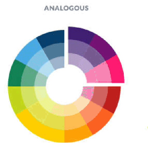
This type of colour palette uses colours that sit next to each other on the colour wheel. This can look great because the colours fit together nicely, but it can also be too subtle – which may be detrimental on a website.
Monochromatic
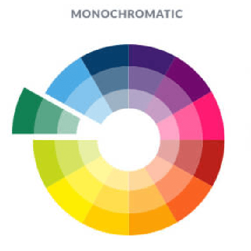
Monochromatic colour palettes use a single colour with various shades and tints of that same colour. This can be visually pleasing but can also miss the contrast needed for something like website design.
Triad
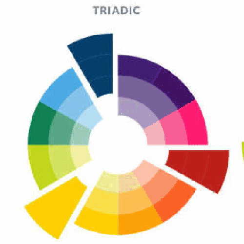
As the name suggests, triad colour palettes consist of three colours that are evenly spaced apart n the colour wheel. This can be risky in website design as it can appear noisy – but this may be ideal for some businesses who are looking to create a youthful, playful and artistic website.
Complementary
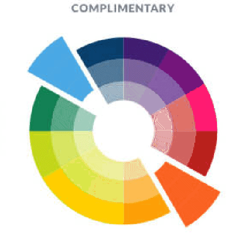
Complementary colour palettes contain colours that are on opposite sides of the colour wheel. This is effective for web design because they create visual balance. However, the colours need to be used at a 70:30 ratio, rather than 50:50 because otherwise, you will lose hierarchy. A complementary colour palette can be used to select a primary brand colour and a supporting, accent colour.
Split Complementary
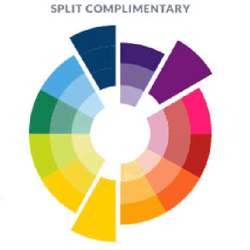
Split complementary colour palettes are similar to complementary colour palettes but introduce a third colour that is near one other colour on the wheel. This is a great alternative to the complementary colour palette if you need more than 2 colours.
How do you use colour in website design
There are lots of free online tools that can help you create a colour palette for your brand or website. If you use the Adobe suite, take a look at Adobe colour, where you can pick colours on the colour wheel to create your own palette. A good place to start is to choose three colours – a main colour, a supporting colour and an accent colour. Use these colours on your website with the 60/30/10 rule – which is 60% your main colour, 30% your supporting colour and 10% your accent colour.
What colours are trending right now?
Although any colour can be used in website design, there are some trending colours being used on websites right now. These change frequently though and it’s often best to avoid relying on a trending colour.
1. Really bright, high contrast colours
Think bright oranges, warm pinks and bold yellows. Many websites will use bright, fun colours to stand out. This may be in reaction to a globally tough 2020/2021 with lockdowns and restrictions – brands are looking to bring back warmth and fun.
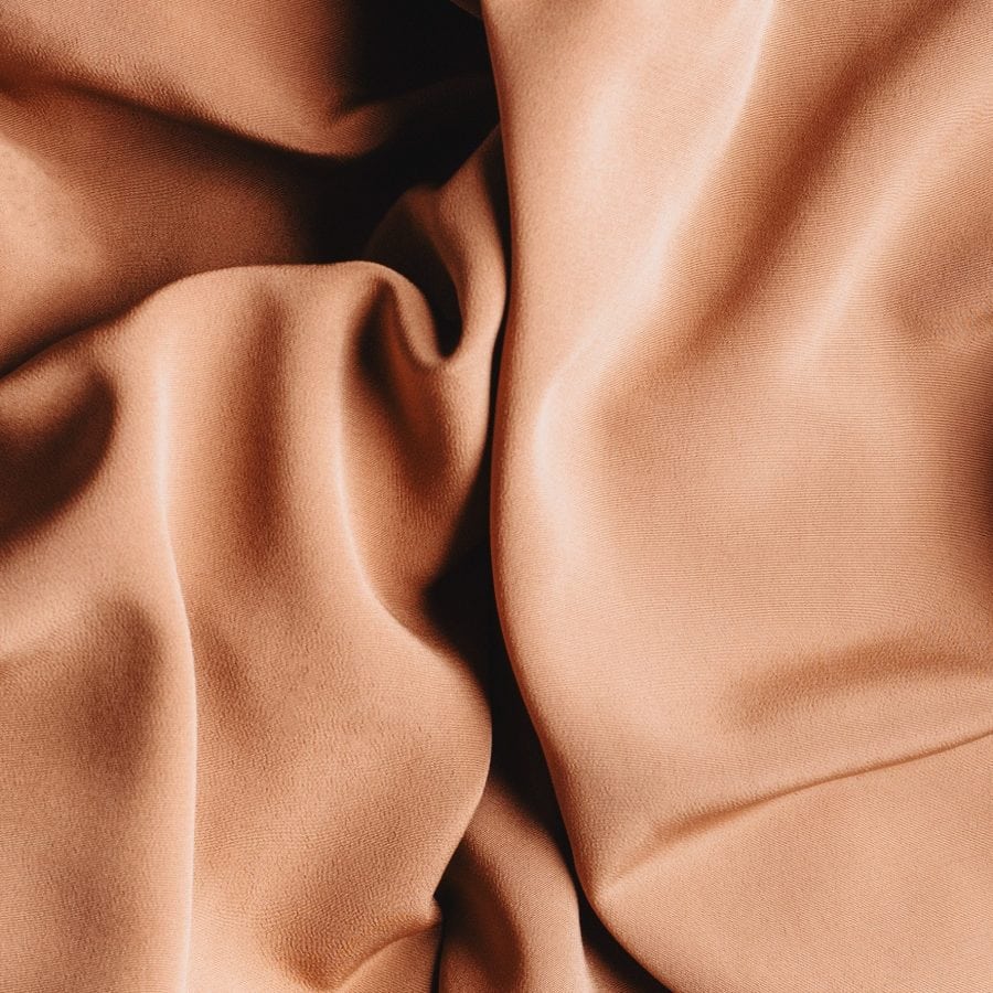
2. Natural tones
Many brands are leaning into soft browns, pale greys and off-whites. This is to bring back a ‘human’ element to a brand.
3. Analogous palettes
This year, people are looking for balance and harmony. You’ll see lots of designs that use one colour and rely on tints and shades to create contrast.
4. Soothing colours
Brands are leaning into colours that will calm and soothe their audience. This is often in the form of a deep, strong colour paired with soft pastel.
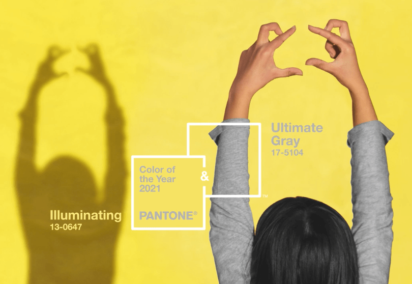
5. Pantone’s colour of 2021
Every year, Pantone selected a colour that represents the world at that time. This year, the 2021 Pantone colour of the year was actually two colours: Illuminating Yellow and Ultimate Gray.